
|
|
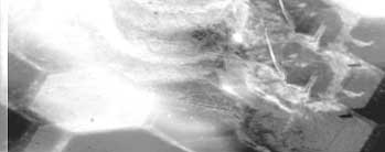
Can you come out here and cut Paranoid? "I think that was basically how I was invited to participate in this project. And my response was something like…'Sure. When?'" recalls editor Eric Tozzi of his initial phone call from me. Soon after, Tozzi was on a plane from his hometown of Scottsdale Arizona to Los Angeles where he and I would spend a long weekend piecing together the visual components of Paranoid. Editing began on Friday night, August 20, 1999 and continued through Sunday evening, August 22. "We began the cut in sort of a conventional manner, working through the shots according to the script, Jay's notes, and the storyboards," offers Tozzi. We worked from the temporary edited voice-over to orchestrate the film's overall timing. Eventually, the voice-over would be re-edited and re-mastered to match picture more naturally, but the combination of slaving image to sound and then sound back to image was the key to creating an organic feeling to the visual narrative. Not all was wine and roses, however. At the end of Saturday night, we went home less than ecstatic with our work-in-progress. "After we had a refined first assembly there was this nagging feeling that we were missing something; that the film needed more." The cut was coming along great, and there was nothing wrong with it - but it wasn't quite what it could be. We both felt that we could push the envelope a bit more and were glad that we had a full day left to do so. When we went back to my apartment that night, I watched the cut a few times and realized what we were really missing was the presence of the Woman in the editing. I realized that we could get much more frenetic and chaotic with the editing style to more dramatically reflect her psychosis. By far, the best example of what I was thinking was Kyle Cooper's magnificent opening credit sequence for David Fincher's Seven. I popped in my copy of the Seven and watched the sequence again and thought - YES! That's what we're looking for! "We brought the film into the edit bay with us and looked at the opening title sequence together," affirms Tozzi. "From watching that we both decided that our film could use some visual thrashing. We realized that we could do some unconventional cuts and make it work very well. After all, the whole perspective of this film is from the shattered vision of a paranoid woman. So, as she describes the world she sees we would break in with these various images, sometimes in rapid-fire cuts, sometimes in more blatant visuals. All of it grew out of experimentation." The 'thrashing' consisted not only of quick, near-subliminal like cuts, but also of color desaturation, image reversal, super impositions, image misalignments and various effect treatments on single frames of the picture. "I'd try something with three or four frames and ask Jay for feedback," continues Tozzi, "and we'd go through the film section by section, adding these visual 'glitches' here and there to punch up what was happening with the narrative. One of the things I try to avoid as an editor is adding FX or anything just for the sake of adding it. If it doesn't compliment the story, it doesn't belong in the film. "Overall, when you watch the film, you'll notice that the interruptive cuts and frame distortions build gradually. It starts with just a few and as the narrative gets more and more frantic, the visuals do the same. Everything that happens visually is there to accent or augment what is happening in the poem." Below are three frames from the dung beetle sequence showing the concept of single-frame manipulation. In between the two normal frames there are several frames of a negative image of the same action. If you look closely, you'll also notice that the negative frame is slightly pushed over to the right and superimposed over a properly aligned image. This mis-alignment was a technique that we used quite a bit to shake up the image.
  To further illustrate the editing style we're talking about, we've provided a QuickTime clip (300kb) of the Beetle sequence from the film. Using frame-by-frame playback (with the left and right cursor keys) in your QuickTime player, you can see how the sequence was "thrashed" a bit to achieve chaotic visual energy and then watch it play in full motion for the final effect. "You can use this same technique to learn from your favorite films," Tozzi offers to aspiring editors. "Use your still frame capability [on your VCR or DVD player] and go through some edits frame by frame. Then play it back normal speed. Then frame by frame again. Start to get a feel for how and why the shots were assembled as they were. Then try watching the scene through at normal speed without any sound! This will force you to rely on your eyes only and you can really see what the scene plays like visually." © 2000 Adakin Productions Paranoid: A Chant © Stephen King. Used by permission. All rights reserved. Digital captures by MAP-MEDIA.com Last Update 25 Apr 2001 |